The Power of Branding: Designing a website that reflects your SMB's brand identity
Branding plays a crucial role in shaping the perception of your small business and differentiating it from competitors. When it comes to web design and development, incorporating your brand identity into your website is essential for creating a cohesive and memorable online presence. In this article, we will explore the power of branding and provide valuable tips on designing a website that reflects your SMB’s (Small or Medium Business) brand identity. By paying attention to visuals, colour scheme, typography, and messaging, you can establish a strong brand presence online and unlock the business benefits that come with it.

Today’s blog is going to discuss the role of branding in web design and development, offering tips on incorporating a cohesive brand identity into a website’s visuals, colour scheme, typography, and messaging. More importantly we are going to look at the theory of how these can lead to business benefits to further your brands read, recognition and help convert website visitors to leads, customers and ultimately advocates and promotors.
Understanding Brand Identity
Before diving into web design, it’s important to have a clear understanding of your SMB’s brand identity. This includes your unique value proposition, brand personality, target audience, and core messaging.
Let’s explore the key elements of a brand identity and their business benefits, along with where on your website you should consider their application.
Building your brand’s Visual Identity
Your visual identity encompasses your logo, colour palette, typography (font) and visual elements that visually represent your brand. Here’s how it benefits your business:
- Brand Recognition: A well-designed logo builds brand recognition and helps customers easily identify and remember your business. Place your logo prominently in the header or top left corner of your website for maximum visibility.
- Consistency: Consistent use of your brand’s visual elements across your website fosters a cohesive and professional look, leaving a lasting impression on visitors.
- Application: Apply your visual identity throughout your website’s design, including the header, footer, and other key sections. Use your brand’s colours for buttons, headings, and backgrounds to create a unified visual experience.
Discovering your brand’s Tone of Voice
Your brand’s tone of voice refers to the style, language, and personality reflected in your messaging. Consider the following benefits:
- Brand Differentiation: A distinct tone of voice sets you apart from competitors and helps you stand out in the minds of your target audience. Apply your brand’s tone of voice in your website’s copy, headlines, and calls-to-action.
- Audience Connection: Consistent use of a specific tone helps build an emotional connection with your audience, allowing them to relate to your brand on a deeper level. This connection can lead to increased trust and loyalty.
- Application: Infuse your brand’s tone of voice in your website’s content, from the homepage to product descriptions and blog posts. Use language and messaging that align with your brand’s personality and resonates with your target audience.
Standardising your brand’s Core Messaging
Your core messaging encompasses your brand’s mission, values, and unique value proposition. Here are the benefits it brings:
- Brand Clarity: Clearly articulating your brand’s mission and values on your website helps visitors understand what your business stands for and what sets you apart from competitors.
- Customer Appeal: Highlighting your unique value proposition demonstrates why customers should choose your products or services over others. This can increase conversions and customer loyalty.
- Application: Incorporate your core messaging in your website’s About Us page, homepage, and product or service descriptions. Clearly communicate your mission, values, and the benefits customers can expect from choosing your brand.
By understanding and applying these elements of brand identity on your website, you can create a cohesive and impactful online presence. Consistency across your visual identity, tone of voice, and core messaging establishes a strong foundation for your brand, enabling you to differentiate yourself, connect with your audience, and drive business growth.
Real-world brand identity case study: Innocent Drinks

Let’s take the example of “Innocent Drinks,” a well-known UK-brand specialises in smoothies and juices. Here’s how they understand their brand identity and use their website to build their visual identity, tone of voice, and core messaging.
Understanding Innocent Drinks’ brand identity
Innocent Drinks positions itself as a health-conscious and sustainable brand that offers natural and delicious beverages. They focus on using fresh, high-quality ingredients and promoting a healthy lifestyle. Their target audience includes health-conscious individuals seeking nutritious and refreshing drinks.
Building Innocent Drinks’ visual identity
On Innocent Drinks’ website, their visual identity is reflected in their logo, which features a playful handwritten font and a simple leaf symbol. The colour palette consists of vibrant and fresh hues, such as green, orange, and yellow. The website incorporates lively and eye-catching visuals, including images of fresh fruits, ingredients, and people enjoying their products. This visual identity conveys a sense of vitality and aligns with their brand’s focus on natural goodness.
Establishing Innocent Drinks’ tone of voice
Innocent Drinks’ tone of voice is friendly, witty, and approachable. Their website uses conversational language that reflects their brand’s playful and down-to-earth personality. They communicate their commitment to transparency, authenticity, and sustainability through humorous and engaging copy. This tone resonates with their target audience and fosters a sense of trust and connection.
Highlighting Core Messaging
Innocent Drinks’ core messaging revolves around three key aspects: natural ingredients, ethical practices, and promoting a healthy lifestyle. On their website, they highlight their dedication to using only natural and sustainably sourced ingredients in their drinks. They emphasise their ethical initiatives, such as supporting farmers and reducing their environmental impact. Innocent Drinks also focuses on encouraging a healthy lifestyle through their products and inspiring content, such as recipes and wellness tips.

Through their website, Innocent Drinks effectively builds their brand’s visual identity, tone of voice, and core messaging. The visual elements, including their logo, colour palette, and vibrant imagery, create an energetic and recognisable brand experience. Their friendly and witty tone of voice engages their audience and conveys their brand’s personality. The core messaging emphasises their commitment to natural ingredients, ethical practices, and promoting a healthy lifestyle. Innocent Drinks’ website successfully communicates their brand identity, positioning them as a trusted and enjoyable choice for health-conscious consumers in the UK.
Reinforcing Visual Consistency across your site to build brand recognition
Visual consistency plays a vital role in building brand recognition and creating a cohesive user experience on your website. Let’s explore the key elements of visual consistency and their business benefits, along with where on your website you should consider their application.
Logo Placement for optimum impact
Your logo is a visual representation of your brand and acts as a symbol of recognition. Consider the following benefits:
- Brand Recognition: Placing your logo prominently on your website, typically in the header or top left corner, ensures it is easily visible to visitors. This consistent placement helps build brand recognition and reinforces your brand’s identity.
- Professionalism and Trust: A well-placed and well-designed logo conveys professionalism and establishes trust in the minds of your audience. It serves as a visual anchor for your website.
- Application: Display your logo prominently in the header or top left corner of your website on all pages. Ensure it links back to your homepage, allowing visitors to easily navigate back to your main content.
Consistent Colour Scheme that supports your all brand identity
Consistency in your brand’s colour scheme across your website reinforces brand identity and creates a visually appealing experience. Consider the following benefits:
- Brand Recognition: Consistently using your brand’s colours helps visitors associate those colors with your business. This recognition reinforces brand identity and increases recall.
- Emotional Connection: Colours evoke emotions and can shape the perception of your brand. Consistent use of your brand’s colour palette helps establish an emotional connection with your audience, enhancing their overall experience.
- Application: Apply your brand’s colour scheme consistently throughout your website’s design elements, such as buttons, backgrounds, headings, and links. Use colour to create visual hierarchy and guide visitors’ attention to important elements.
Imagery that supports your business brand identity
Carefully selected and consistent imagery contributes to your brand’s visual consistency and overall aesthetic. Consider the following benefits:
- Brand Personality: Images that align with your brand’s personality and target audience reinforce your brand’s identity and values. Consistency in image style, composition, and subject matter helps create a unified brand aesthetic.
- Emotional Appeal: Imagery has the power to evoke emotions and connect with your audience on a deeper level. Consistent imagery that resonates with your brand’s tone and values can strengthen emotional engagement.
- Application: Select images that align with your brand’s style and target audience. Apply consistent image treatments, such as filters or editing techniques, to create a cohesive visual experience. Use images strategically on your website’s pages, particularly on the homepage, product pages, and blog posts.
By reinforcing visual consistency across your website, you enhance brand recognition, establish professionalism and trust, and create a visually engaging experience for your visitors. Consistent logo placement, colour scheme, and imagery application contribute to a cohesive brand identity, ensuring that your SMB stands out and leaves a memorable impression on your target audience.
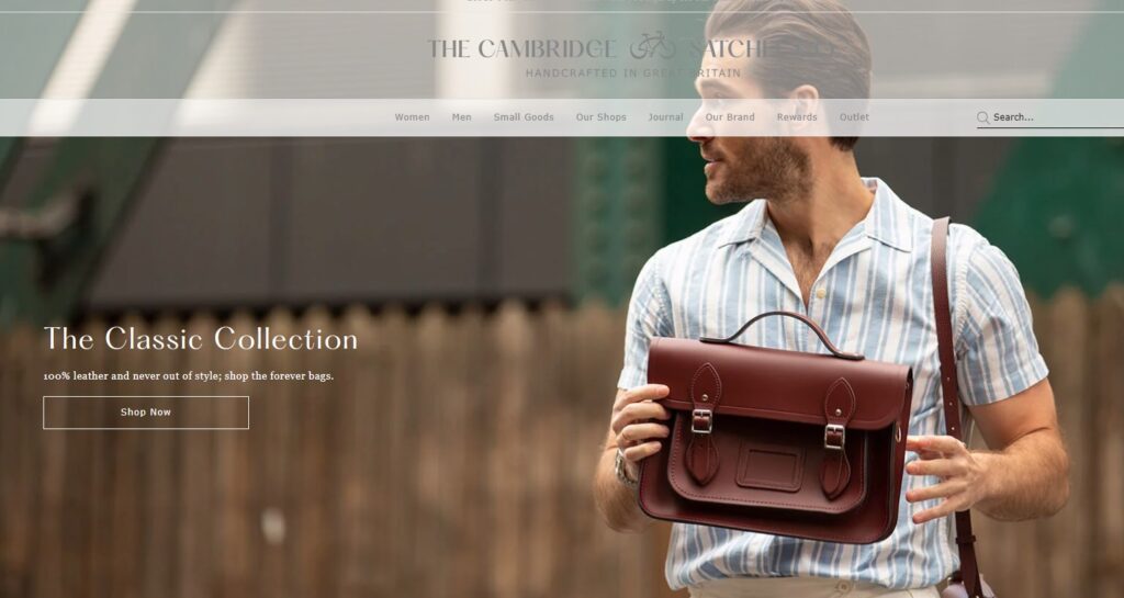
Visual consistency case study: The Cambridge Satchel Company
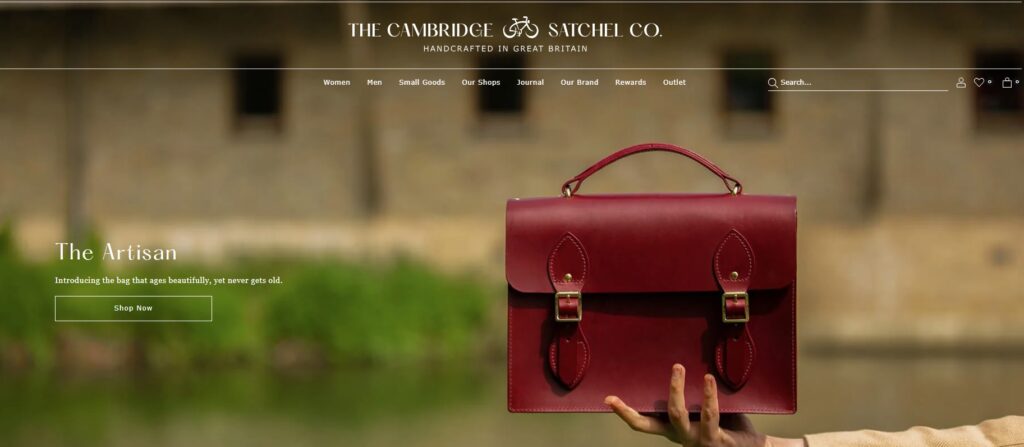
Let’s take the example of “The Cambridge Satchel Company,” a UK-based brand specialising in handmade leather satchels and bags. Here’s how they reinforce visual consistency across their website to build brand recognition, utilising careful logo positioning, a consistent colour scheme, and imagery that supports their brand identity.
Logo positioning for great effect
The Cambridge Satchel Company strategically positions their logo prominently on their website, typically at the top left or centre of the page. The logo features their brand name in a distinctive font with an accompanying emblem or symbol. Placing the logo prominently ensures immediate brand recognition and association, establishing a consistent visual presence across the website.
Consistent Colour Scheme
The Cambridge Satchel Company maintains a consistent colour scheme that aligns with their brand identity and the craftsmanship of their products. Their website often features a combination of earthy and sophisticated tones, such as rich browns, deep burgundies, and elegant neutrals. This colour palette reflects the brand’s commitment to quality, timelessness, and classic style.
Supportive Imagery
The imagery used by The Cambridge Satchel Company supports their brand identity as a luxury leather goods brand with a focus on craftsmanship and heritage. The website showcases high-quality product photographs that highlight the fine details, textures, and craftsmanship of their satchels and bags. Additionally, lifestyle images featuring models or customers using their products are used to evoke a sense of style and showcase the versatility of their designs.
By carefully positioning their logo, maintaining a consistent colour scheme, and utilising imagery that supports their brand identity, The Cambridge Satchel Company reinforces visual consistency across their website. This approach enhances brand recognition and creates a cohesive visual experience for visitors. The cohesive visual elements reflect the brand’s commitment to quality, craftsmanship, and timeless style, establishing The Cambridge Satchel Company as a reputable and recognisable name in the luxury leather goods sector.
Choosing Typography to help build brand identity
Typography plays a significant role in conveying your brand’s personality and enhancing the overall visual appeal of your website. Let’s delve into the key elements of typography and their business benefits, along with where on your website you should consider their application.
Font Selection – not just what looks nice!
Choosing the right fonts for your website helps establish a consistent brand identity and reinforces your brand’s personality. Consider the following benefits:
- Brand Differentiation: Unique and distinctive fonts can set your brand apart from competitors and contribute to a memorable user experience. Select fonts that align with your brand’s tone and values to create a distinct identity.
- Readability and Accessibility: Clear and legible fonts enhance the readability of your website’s content. Ensure your font choices are accessible across different devices and screen sizes to accommodate all users.
- Application: Select a primary font and additional complementary fonts that reflect your brand’s personality. Use the primary font for headings, subheadings, and important elements, while the complementary fonts can be applied for body text and secondary content.
Content Hierarchy and Readability
Establishing a clear hierarchy and ensuring readability of your typography contributes to a positive user experience and effective communication. Consider the following benefits:
- Visual Hierarchy: Applying different font sizes, weights, and styles helps guide visitors’ attention and emphasises important information. This hierarchy enhances the flow and organisation of your content.
- Easy “Scan-ability”: Well-structured typography facilitates quick and effortless scanning of your website’s content. Use headings, subheadings, and bullet points to break up text and make it more digestible.
- Application: Implement a clear hierarchy by using larger font sizes for headings, medium sizes for subheadings, and smaller sizes for body text. Use bold or italic styles sparingly to highlight key points. Ensure there is sufficient spacing between lines and paragraphs for optimal readability.
Consistency drives brand identity and recognition
Consistency in typography across your website creates a unified and professional visual experience. Consider the following benefits:
- Brand Cohesion: Consistent typography strengthens brand recognition and creates a cohesive brand identity. It fosters a sense of familiarity and trust in your audience.
- Professionalism: A consistent typographic style conveys professionalism and attention to detail. It enhances the overall aesthetic of your website and instills confidence in your brand.
- Application: Apply consistent typography across your entire website, including headings, subheadings, body text, buttons, and navigation menus. Use the same font styles, weights, and sizes consistently to maintain visual coherence.
By carefully selecting and applying typography on your website, you can reinforce your brand identity, enhance readability, and create a visually pleasing experience for your visitors. Consistent font selection, hierarchy, and readability contribute to a cohesive and professional representation of your brand, fostering a positive perception and building a strong brand image in the minds of your target audience.
Monzo: a case study of visual consistency to reinforce brand identity

Let’s take the example of “Monzo,” a popular UK-based digital bank. Here’s how Monzo chooses typography to help build their brand identity across their website in the service and finance industries, emphasising careful font choice, hierarchy, readability, and a consistent approach to drive brand recognition.
Font Choice
Monzo selects fonts that align with their brand identity as a modern and user-friendly digital bank. They may opt for clean and geometric sans-serif fonts that exude a sense of simplicity, clarity, and professionalism. These fonts convey a modern and innovative image, reflecting Monzo’s commitment to providing a seamless digital banking experience.
Hierarchy and Readability
Monzo ensures a clear typographic hierarchy across their website to guide users’ attention and improve readability. They use larger font sizes and bolder weights for headings and key information to make them stand out. Smaller font sizes and lighter weights are used for body text and supplementary details to maintain readability. Monzo also pays attention to line spacing and kerning to ensure comfortable reading experiences for their users.
Consistent Approach
Monzo maintains a consistent typographic approach across their website, mobile app, and other brand touchpoints. This consistency helps in establishing a strong and recognisable visual identity. The use of consistent fonts, sizes, and styles creates a seamless experience for users and reinforces the brand recognition of Monzo across different platforms.
Brand and Recognition
By carefully choosing typography, establishing a clear hierarchy, ensuring readability, and maintaining a consistent approach, Monzo strengthens brand recognition within the service and finance industries. The selected fonts and typographic choices reflect Monzo’s focus on simplicity, transparency, and user-centred design. Consistency in typography enhances brand recognition, as users associate the font choices with Monzo’s digital banking services, fostering trust and loyalty.
By leveraging typography in their website design, Monzo effectively builds their brand identity and recognition in the service and finance industries. The careful font choice, typographic hierarchy, readability, and consistency contribute to a visually cohesive representation of their brand. These typographic decisions align with Monzo’s commitment to providing a modern, user-friendly, and innovative banking experience, establishing them as a trusted digital bank in the minds of their customers.
Brand Messaging to reinforce build brand identity
Effective brand messaging is essential for establishing a strong brand identity and connecting with your target audience. Let’s explore the key elements of brand messaging and their business benefits, along with where on your website you should consider their application.
Make sure your Elevator Pitch is consistent with your brand identity
An elevator pitch is a concise and compelling statement that communicates your brand’s unique value proposition. Consider the following benefits:
- Differentiation: An effective elevator pitch helps differentiate your brand from competitors and communicates why customers should choose you. It highlights your unique selling points and what sets you apart.
- Immediate Impact: Placing your elevator pitch prominently on your homepage ensures visitors quickly understand the value your brand offers. It captures their attention and encourages them to explore further.
- Application: Display your elevator pitch prominently on your homepage, above the fold, to make an immediate impact. Craft a concise and engaging statement that clearly communicates the core benefits of your products or services.
Use Tone and Language that is consistent and congruent with your brand identity
Your brand’s tone and language shape how your brand is perceived by your audience. Consider the following benefits:
- Consistency: Using a consistent tone and language throughout your website builds familiarity and reinforces your brand’s personality. It creates a cohesive experience for visitors, increasing recognition and recall.
- Emotional Connection: The right tone and language can evoke emotions and establish a deeper connection with your audience. It helps them relate to your brand and creates a sense of trust and loyalty.
- Application: Apply your brand’s tone and language in all written content on your website, including headlines, product descriptions, blog posts, and calls-to-action. Ensure the tone aligns with your brand’s values and resonates with your target audience.
Storytelling that compels engagement with your brand
Storytelling allows you to share your brand’s journey, values, and mission with your audience. Consider the following benefits:
- Engaging Experience: Storytelling captures attention and creates a memorable experience for visitors. It helps them connect with your brand on an emotional level, fostering a sense of loyalty and advocacy.
- Brand Identity Reinforcement: Through storytelling, you can reinforce your brand’s identity, values, and mission. It enables visitors to understand the purpose and passion behind your business, strengthening their connection with your brand.
- Application: Incorporate storytelling elements on your About Us page, homepage, or dedicated brand story section. Share your brand’s history, values, and the impact you aim to make. Use engaging narratives and visuals to bring your story to life.
By incorporating brand messaging into your website, you can establish a strong brand identity, differentiate yourself from competitors, and foster a deeper connection with your audience. Applying an impactful elevator pitch, consistent tone and language, and compelling storytelling throughout your website creates a cohesive brand experience that resonates with visitors. This, in turn, drives customer engagement, builds trust, and leads to long-term business success.
Patagonia: a case study of Brand Messaging to reinforce identity

Let’s take the example of “Patagonia,” a well-known outdoor clothing and gear company. Here’s how Patagonia uses brand messaging across their website to build brand identity, reinforce brand recognition, and engage customers with a great elevator pitch, consistent tone and language, and compelling storytelling.
Elevator Pitch
Patagonia’s elevator pitch might go something like this: “Patagonia is a purpose-driven outdoor clothing and gear company committed to protecting the planet. Our high-quality products are designed for adventurers and nature enthusiasts who value sustainability and durability. With a deep respect for the environment, we aim to inspire and implement solutions to the environmental crisis. Choose Patagonia to adventure responsibly.”
Tone and Language
Patagonia maintains a consistent tone and language that aligns with their brand identity as an environmentally conscious and socially responsible company. Their tone is passionate, authentic, and informative, conveying their dedication to sustainability and activism. The language they use is down-to-earth, educational, and empowering, encouraging customers to make informed choices and join the movement for a better world.
Consistency and Congruence
Patagonia ensures that their brand messaging is consistent and congruent across their website and various communication channels. From product descriptions to blog articles and social media posts, the messaging consistently reflects their brand values of environmental stewardship, quality, and adventure. This consistency helps build trust, loyalty, and reinforces their brand identity.
Compelling Storytelling
Patagonia excels in using storytelling to engage and inspire their customers. Through their website, they share stories about environmental activism, conservation efforts, and personal adventures. They highlight their commitment to sustainability, fair trade, and supply chain transparency. These stories create an emotional connection with customers, demonstrating how their purchases contribute to a greater cause and a more sustainable future.
By effectively using brand messaging across their website, Patagonia builds their brand identity, reinforces brand recognition, and engages customers. Their elevator pitch captures the essence of their brand values and purpose. The consistent tone and language reflect their commitment to sustainability and social responsibility. Compelling storytelling immerses customers in their brand narrative and inspires them to take action. Patagonia’s brand messaging resonates with their target audience, fostering a sense of community and encouraging customers to join their mission of environmental conservation.
Designing a website that reflects your SMB’s brand identity is a powerful way to establish a memorable and cohesive online presence. By paying attention to visuals, colour scheme, typography, and messaging, you can create a website that resonates with your target audience and sets your business apart from competitors. The consistent representation of your brand identity on your website not only strengthens brand recognition but also builds trust and loyalty among visitors. Unlock the business benefits that come with a strong brand presence by incorporating your brand identity into every aspect of your website’s design and messaging.